Sunday 27 December 2015

Photoshop

I watched a few YouTube tutorials on Photoshop and particularly in how to remove white from the pics to make it look transparent and a little more neater;


This video was very useful as I had a couple of pictures I wanted to get rid of the white for my website so I used this and managed to get about 99% of the white from pics.


Difficulties- Part 2

So the other major difficulties I encountered with this website is the fact that when I press preview in say Firefox or Google Chrome, sometimes the drop-down menu doesn't align. For example;


So I tried to search on google as to why this would happen as it doesn't happen all the time, just sometimes when I open it up, and it said to reload the page so once reloaded, the page is back to normal and everything is aligned which is odd. I still haven't found a solution for that other than to reload the page if it does do that, as as I mentioned before, it sometimes happens, sometimes it doesn't which is rather odd.


Moving from Pictures to Semi-Transparent Background

Half of my website is with images as the background such as these;


These pictures were hard to use behind the font I used for each of the page, so I decided to put in some semi-transparent backgrounds such as these;


These backgrounds are quite good in my opinion as they are still bright and eye-catching however the audience will be able to see the font better because of these backgrounds, I thought it would also be more fun to have different sorts of backgrounds as opposed to just one type of background as that is boring and the audience would be deterred.

Difficulties- Part 1

Throughout the progress of this website, there have been a few difficulties which I have overcome, one the major difficulties was choosing an image as a background for each for each page, that would complement the colour of the font, however the pics that I chose for each of the background were quite strong colours and combined with the brightness of the text, it sometimes didn't really show up, so I did my best to pick some images that worked quite well the colours of the font, however, towards the end of the pages i.e Intermediate and Advanced pages, I changed the pics to semi-transparent backgrounds so the audience can read the font.


Videos

I did have the idea to put a video of 'native speakers' to introduce themselves onto my site if anybody wanted to contact them to talk in a more casual yet proficient way of learning the language. However, videoing and editing never came to fruition but there is a video below that completely envisions what I had in mind if this idea did come to actualisation;


Testmoz

I found this site called TestMoz which is a test generator, I did make one up and completed it as an added extra for the audience to use it to find out what level they are to help them get all the information they need to improve their learning of the language.


Progress-27th December 2015

The progress of this website is going well, still looking back on tutorials to refresh my memory as I don't do tend to my website as regularly as I should, I should learn to prioritise, now that all of my exams are out the way, I can now focus on the website over the Christmas period.

After working through each page and linking it all up, I have now a fully-functioning website with links to each page and each level.


Content of Website

So for this website and the content used in it, I just drew on other learning language websites to get my information. Each of the websites are identical in the way they inform viewers about the language but with various examples. Other than different examples, they were similar so I just used the format and used some examples to back up the information. I kept it brief to keep the attention of the audience while learning all the main points.


Thursday 24 December 2015

Advanced Menu

Again, like the other levels, I have kept it to 3 pages:

  • Subjunctive
  • Future Tenses
  • Conditional Tenses
I have decided to use these as an advanced level because even I, as a student still struggle with these 3 things that are on these particular pages, mainly the top one though, it is rather difficult to grasp and understand so only the advanced audience or native speakers would know a lot more about this 'subjunctive' than the non-native speakers or lower level students.

Intermediate Menu

So for the Intermediate menu, again I kept it to 3 pages of succinct information for the audience. These pages are not getting into more detail than the beginner page with more substance and context such as:
  •  Nouns and Articles
  • Adjectives
  • Adverbs 

Beginner Menu

So for the Beginner's menu, I sectioned it into 3 more pages on the drop down menu for the targeted audience to play around with and test their knowledge of Spanish and also refresh their memory a little bit as well. I  did think about doing a lot more pages for each of the levels but then decided it was way too much work and to be honest, it might confuse the audience if there were so many pages to each level, they may get a bit disheartened, therefore I just left it to 3 simple pages to each level, and on each page I kept it succinct to keep the interest of the audience.


Drop-Down Menu

Ok, so after looking at countless youtube tutorials, and other sites such as these, I have started to progress well with my website. I have decided to do a drop-down menu for site and to separate each level with other pages linking to other pages associated with that Level.


So this is the drop-down menu, I put it in bright colours to attract the viewers, which is contrasted with the darkness of the background, I have also kept it nice and big.

Wednesday 2 December 2015

YouTube Tutorials

There are various YouTube tutorials online that I found very useful such as the ones below;


All of these tutorials and more provide me with a greater depth of knowledge and understanding when it comes to doing my website on Dreamweaver. Dreamweaver to a complete novice as myself was incredibly daunting at the start, however these tutorials keep me in check that I am doing the right thing, and pointing me in the right direction on to how to be more interactive with the target audience and to not make it mundane and tedious for the audience.

Sounds

So, for my website, I was thinking of adding some sounds into it to give it a more exotic feel.

So after looking at a few videos on YouTube I decided to add some soft spanish music in the background with guitars and such.


This YouTube video contains over 72 hours of spanish music, giving an example of what I had in mind for the website.

I was thinking of putting on a loop in the background, however I do think that would be rather repetitive and annoying to the viewers. So I will possibly put on a playlist and continuously play it in the background so the viewers won't get bored.

The Webby Awards

There is a site called the 'Webby Awards' which is all about the top, most popular, most creative websites that people have created and have even achieved awards for their sites. I think this is a very interesting site to draw inspiration from and even a few examples on how to style my website and make it more interactive.


These Webby Awards also have their own YouTube channel, below is a little preview of the host of this year's Webby Awards talking onstage;

This just shows how very prestigious these awards are, which is very interesting to look at some of the short-lists and see what they deem acceptable and worthy of an award.


Friday 20 November 2015

Images

So for the images for my websites, I was thinking of having a few stock photos of Spain such as;

 So a picture of the Spanish flag with the assorted flags to represent the country
 So I also decided to include some pics of beaches to make the page look more appealing
 And also I am thinking of adding some famous tourists spots just to relate to the viewers
 And then also add some pictures of some of the famous and recognisable foods and drinks that Spain offers.


Then for the other pages, I thought I would incorporate some more interesting pictures relating to learning such as these below;


Proposal

This is my Prezi proposal I did for my Spanish Learning Website, it shows my reasons for making one, and the different ideas I had to create it.


Thursday 19 November 2015

Inspiration

Below are some websites which I have looked at for Inspiration for a language learning website;

STUDYSPANISH - This is quite a good website visually as it keeps to the 'natural' colours of Spain, coming from the Spanish flag such as Yellow, Orange and Red. It also shows 3 pages; Beginner, Intermediate and Advanced which I am thinking of incorporating into my websites. However the complications of that is the over-simplifying of one's comprehension of the language. If I looked at this page, I would be a bit confused as to what level I would be. So maybe putting in a Test Your Spanish on to the website so one can assess which level they should pick if they have previously learned the language.

Babbel- Babbel is also a good site as it is very clear and concise and succinct. There are only 2 main colours; White and Orange. It is associated with joy, sunshine, and the tropics. All these things are related to Spain in my opinion. The one bad thing about this website is the fact that there are too many choices and pages to pick. Orange increases oxygen supply to the brain and therefore produces an invigorating effect, and stimulates mental activity. It is highly accepted among young people. So putting orange as a strong colour on my site might appeal to my targeted audience as this is also a fun learning place.

BBC Spanish- I think out of all the other Spanish sites, this seems to be my favourite.


As you can see in the above picture, it has 3 clear columns with very useful stuff on each which would be very handy for my website however the downside to this is that this page has now been archived and it now no longer updated which is a bad thing as it probably has dated vocab, pictures. 'Current news' isn't very current. Aside from that, this is very good page.

Enrichment Week

During Enrichment Week, I took the time to spend a bit more time watching more Youtube tutorials about building and creating my website to the best quality.

Again I looked at examples of Spanish learning websites to draw inspiration  for my own website.

There were a few difficulties regarding the fact that I had to refresh my memory while watching these tutorials again and during a hiatus, coming back to creating my website was a lot harder than I thought it would be as I could not remember particular words and controls to do the website, so I had to spend a few more hours reminding myself how to do certain commands.


Above is a picture of some tutorials regarding the websites and how to add sound to my pages.

Wednesday 21 October 2015

19th October 2015

Monday afternoon, I continued with my tutorials to help me get used to the controls and the commands of html and css and I also had to create a banner for the next lesson so with the help of my friend who recommended this programme called Fotor, I then created a couple of imaginative banners that would help my website come to life.

15th October 2015

Last week, I attempted to watch youtube tutorials on how to create and design websites on Dreamweaver. 

Wednesday 14 October 2015

14th October 2015

Today we learnt more about how to make websites on Dreamweaver which I'm finding more difficult and hard to understand. I need to look at the very basics and work from there as this software is very new to me and I am not used to it so I just need maybe need to practice a bit more and then will eventually get the hang of it.

Tuesday 13 October 2015

Last Week

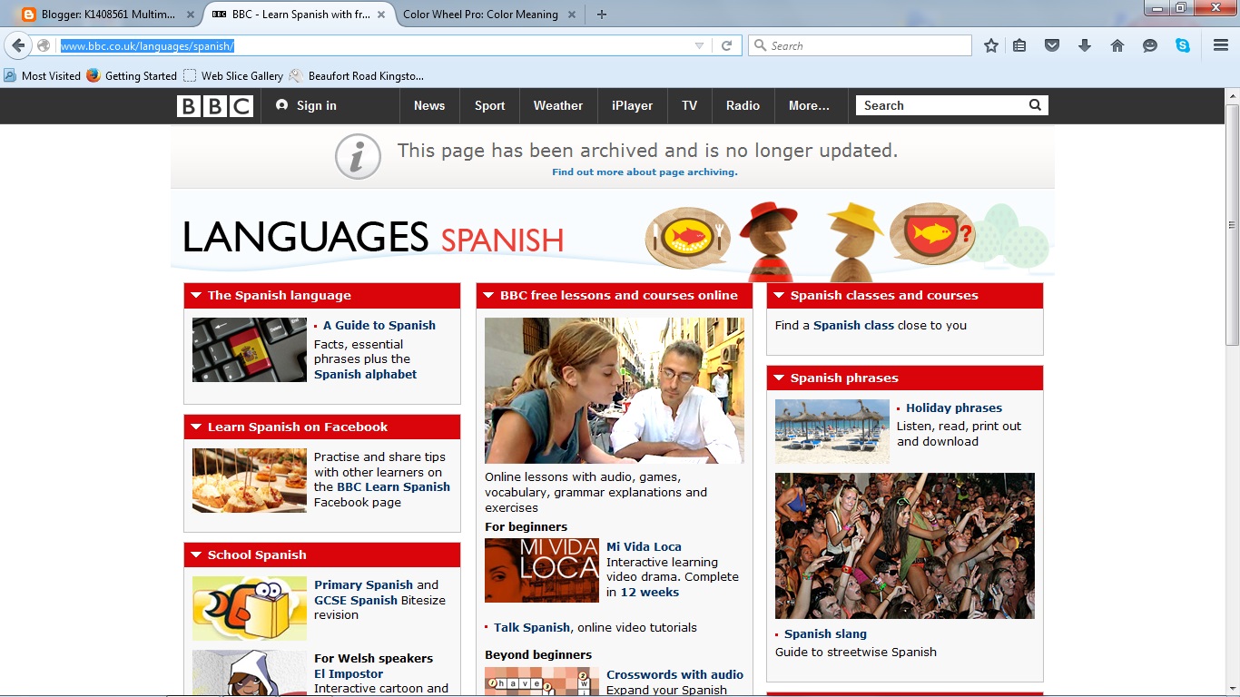
Last week we looked at what this module entails and what we had to do for our projects and the program software we will be using which is called Adobe Dreamweaver to create a website about anything we wanted to do. I had a couple of ideas in mind of what I wanted to do, one of them was a Spanish language learning website for kids, as I am doing a minor in Spanish, which I thought might be good for the spanish part of my degree, and the other idea was an information website about the restaurant I work part time at around the area, which could potentially promote their new restaurant in Central London, as they have already asked me to take some photos for promotion and to send them to a graphic designer in London.